Building a seamless end-to-end bridge between UK taxpayers and HMRC
.webp)
.webp)
.webp)
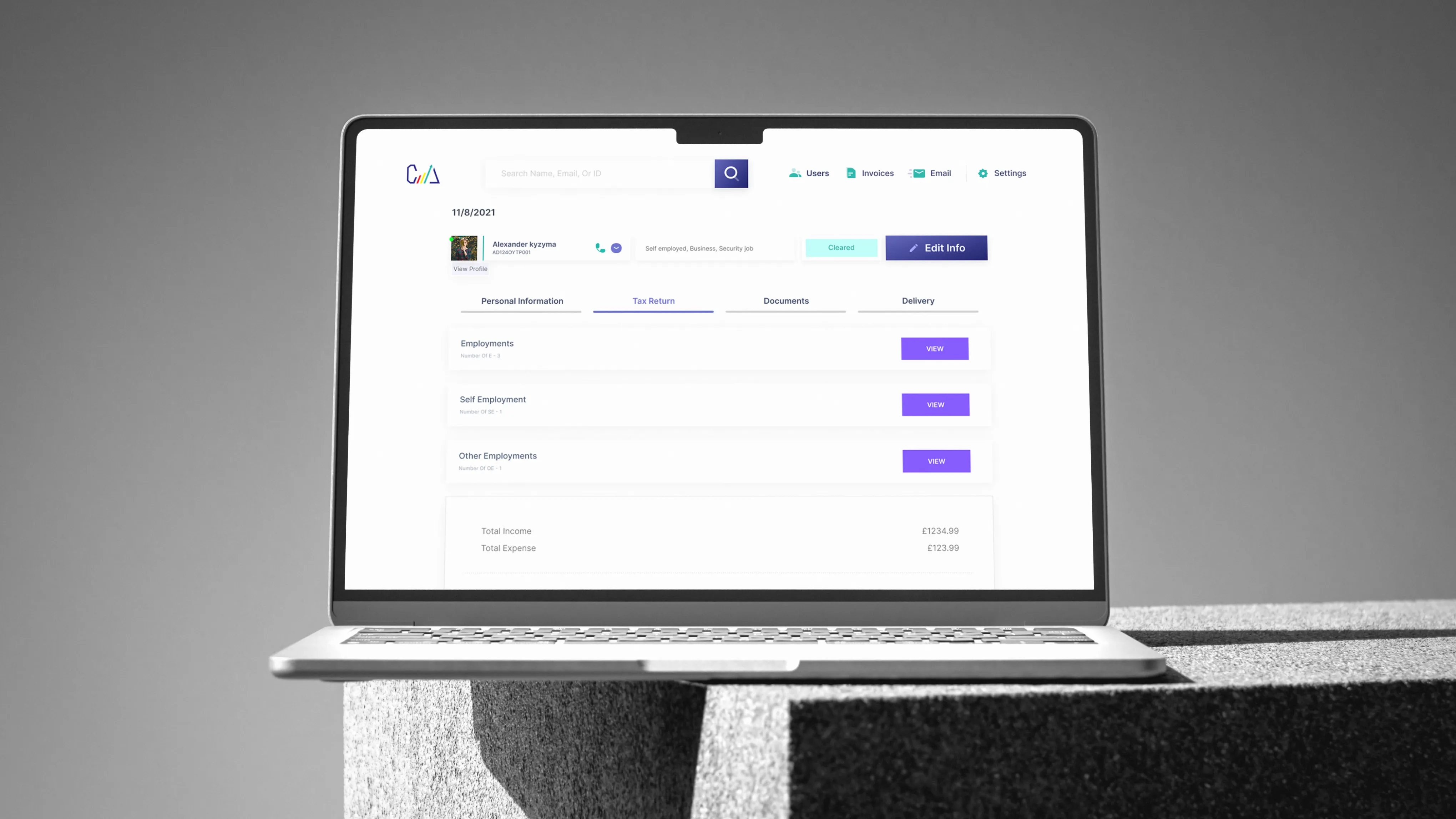
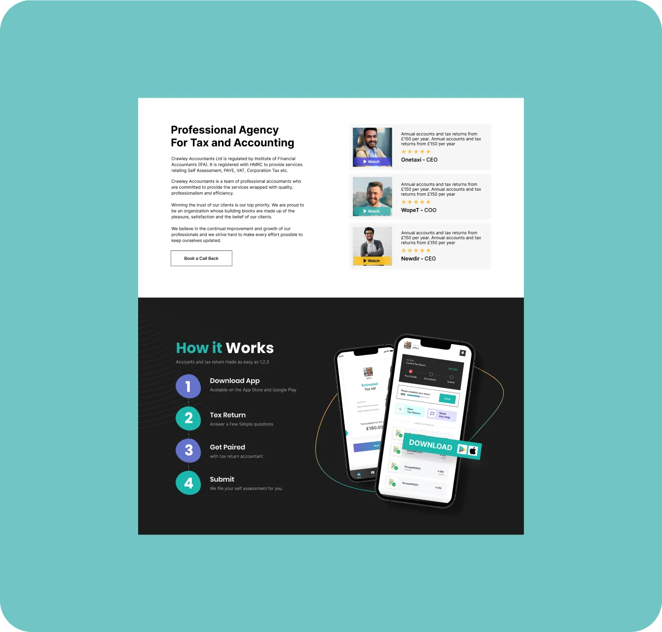
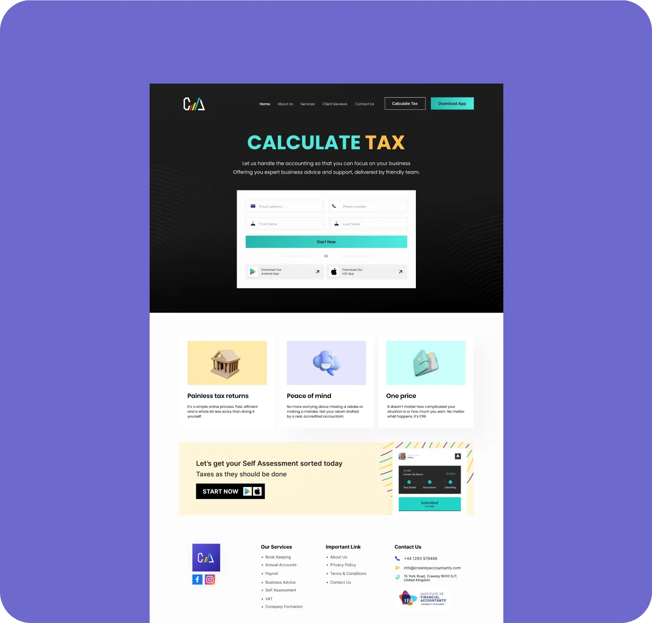
We transformed CAL Accountants from a traditional consultancy into a digital-first leader by delivering a comprehensive end-to-end ecosystem. This integrated solution featured a fresh brand identity, a conversion-driven website, and a powerful CRM coupled with a customer-facing mobile app that automates the entire tax submission and payment process. By replacing manual workflows with seamless HMRC-ready automation, we significantly boosted operational efficiency and accuracy, positioning the firm as a modern, scalable, and trusted partner in the UK tax landscape.
.webp)
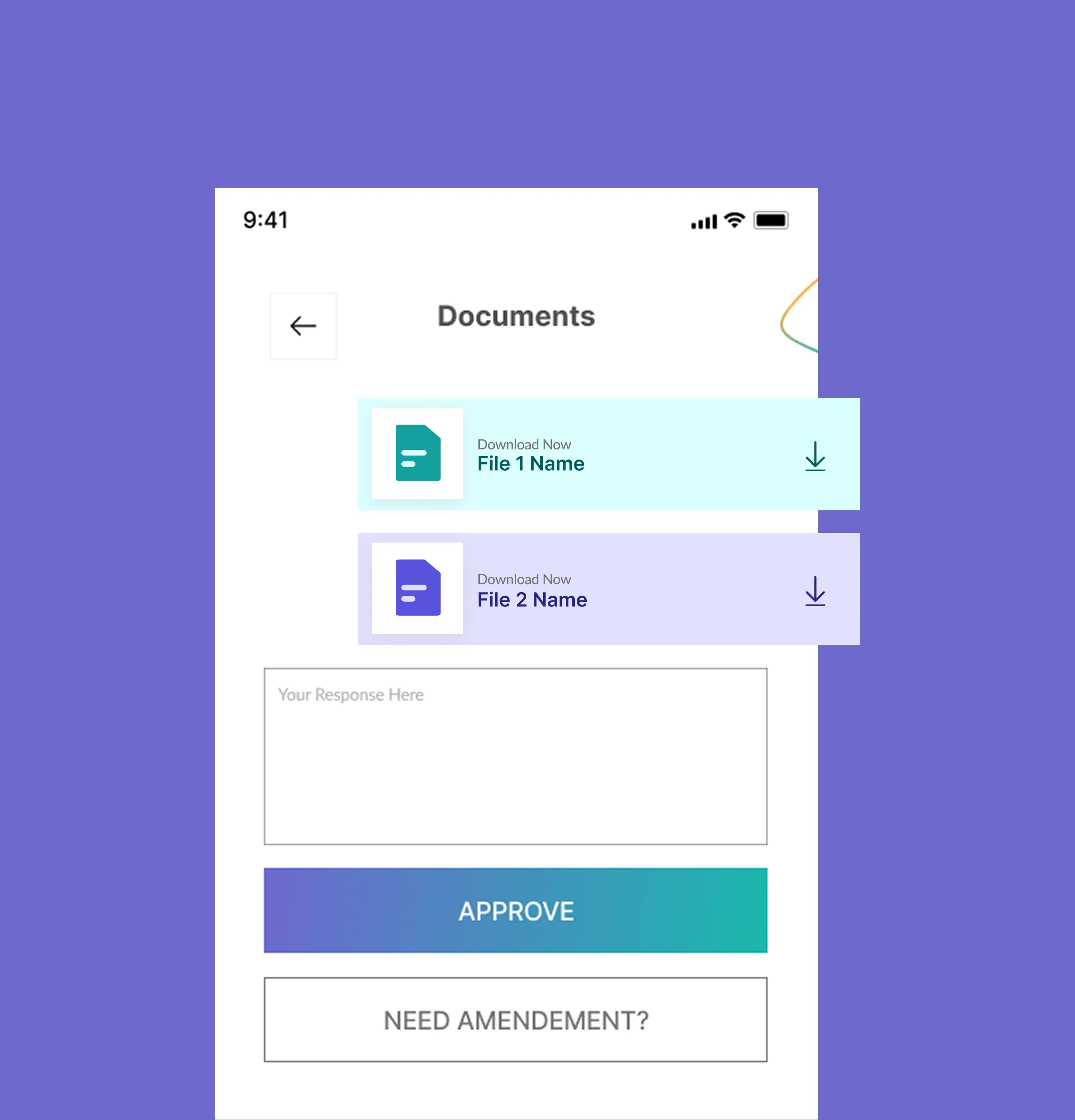
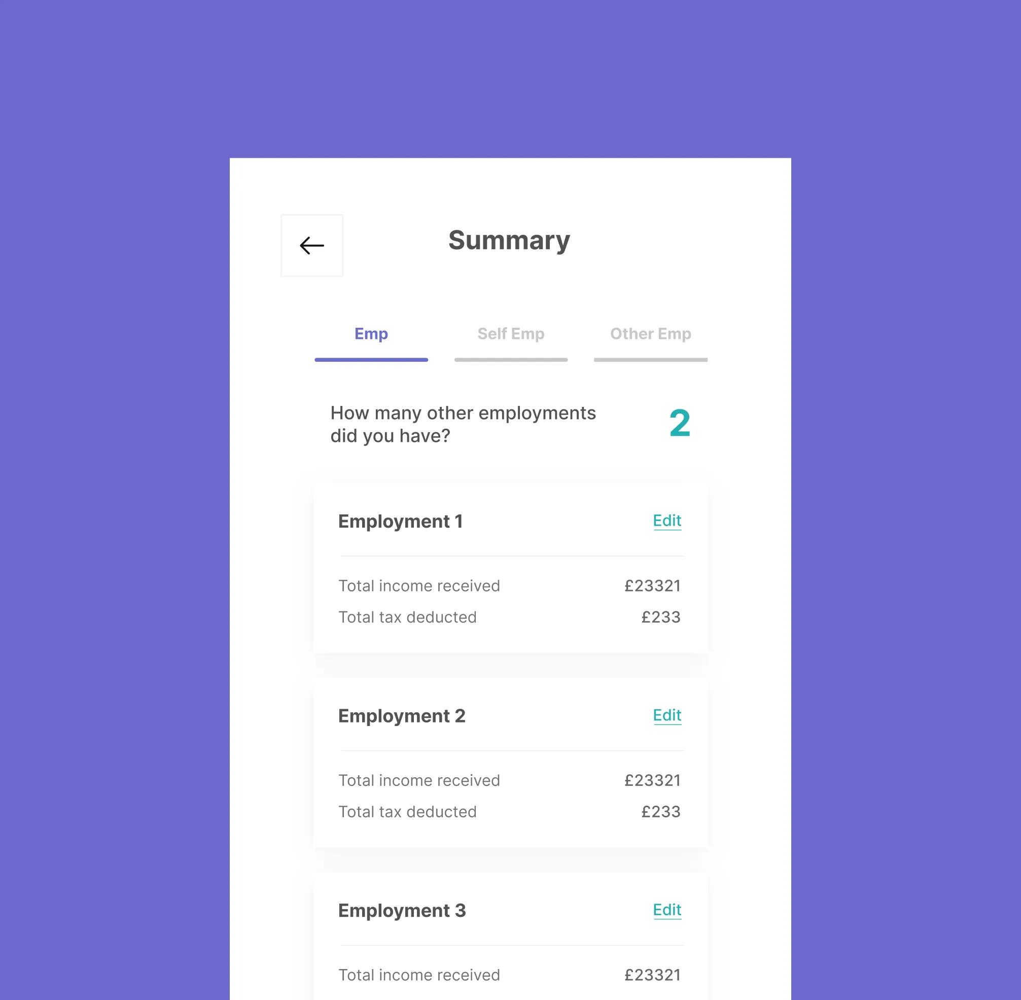
The CAL mobile app empowers users to manage their entire tax journey from their pocket. From secure document uploads and real-time status tracking to automatic tax calculations and in-app payments, we designed a friction-free experience that makes compliance feel effortless.
.webp)
.webp)
The core of Amplify is its Project Management module. Previously, managing complex construction bids and active projects was a heavy, data-dense task that overwhelmed users. I redesigned this feature to prioritize clarity, speed, and customization.
I implemented a robust filtering engine that allows users to drill down by Job Type, Estimator, or Location in seconds. By adding smart search columns and clear status indicators, I reduced the cognitive load on project managers, allowing them to spend less time finding data and more time winning bids.
.webp)
To complement the robust functionality of the iBuild CRM, we developed a visual identity that reflects the precision and reliability of the construction industry. The iBuild logo utilizes a clean, geometric typeface paired with a stylized roofline icon, symbolizing the core of the business. For typography, the Inter font family was chosen for its exceptional clarity in data-heavy environments, providing a range of weights from Regular to Bold that help establish a clear visual hierarchy throughout the application.
To complement the robust functionality of the iBuild CRM, we developed a visual identity that reflects the precision and reliability of the construction industry. The iBuild logo utilizes a clean, geometric typeface paired with a stylized roofline icon, symbolizing the core of the business. For typography, the Inter font family was chosen for its exceptional clarity in data-heavy environments, providing a range of weights from Regular to Bold that help establish a clear visual hierarchy throughout the application.
.webp)
.webp)
From strategy and UX/UI to custom development and performance optimization, we offer a full suite of capabilities that support your product throughout its lifecycle.
.webp)
.webp)
.svg)
11 Burford Road, e152st
.svg)
.svg)
C-Block, Citi Housing Jhelum, 49600
.svg)
.svg)

.webp)
