Frictionless Food Ordering: Balancing Minimalism with Functional Depth
.webp)
.webp)
.webp)
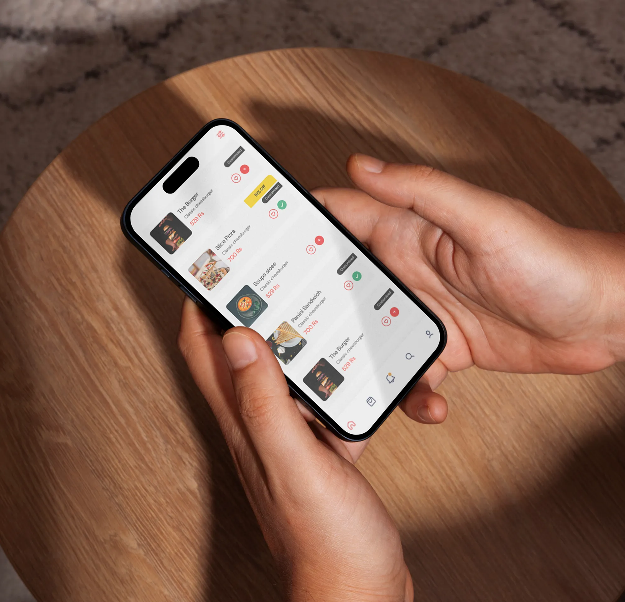
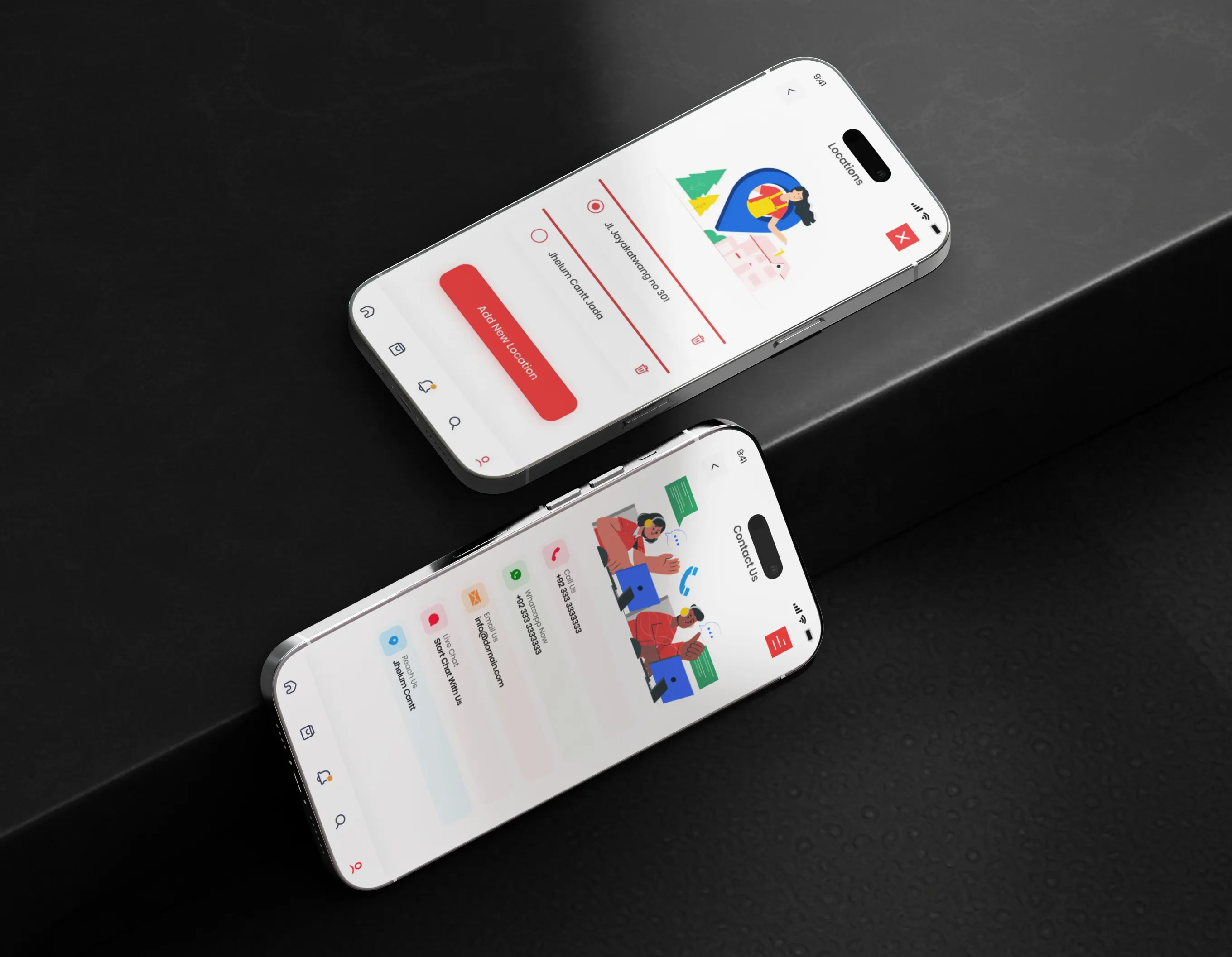
This project involved designing a comprehensive food delivery mobile application from initial concept to final high-fidelity UI. The goal was to create a "one-stop" solution that combines a modern, minimalist aesthetic with a highly intuitive user journey. By focusing on streamlined navigation, and clear product categorization, the design ensures a seamless and engaging experience that allows users to browse and order their favorite meals with ease.
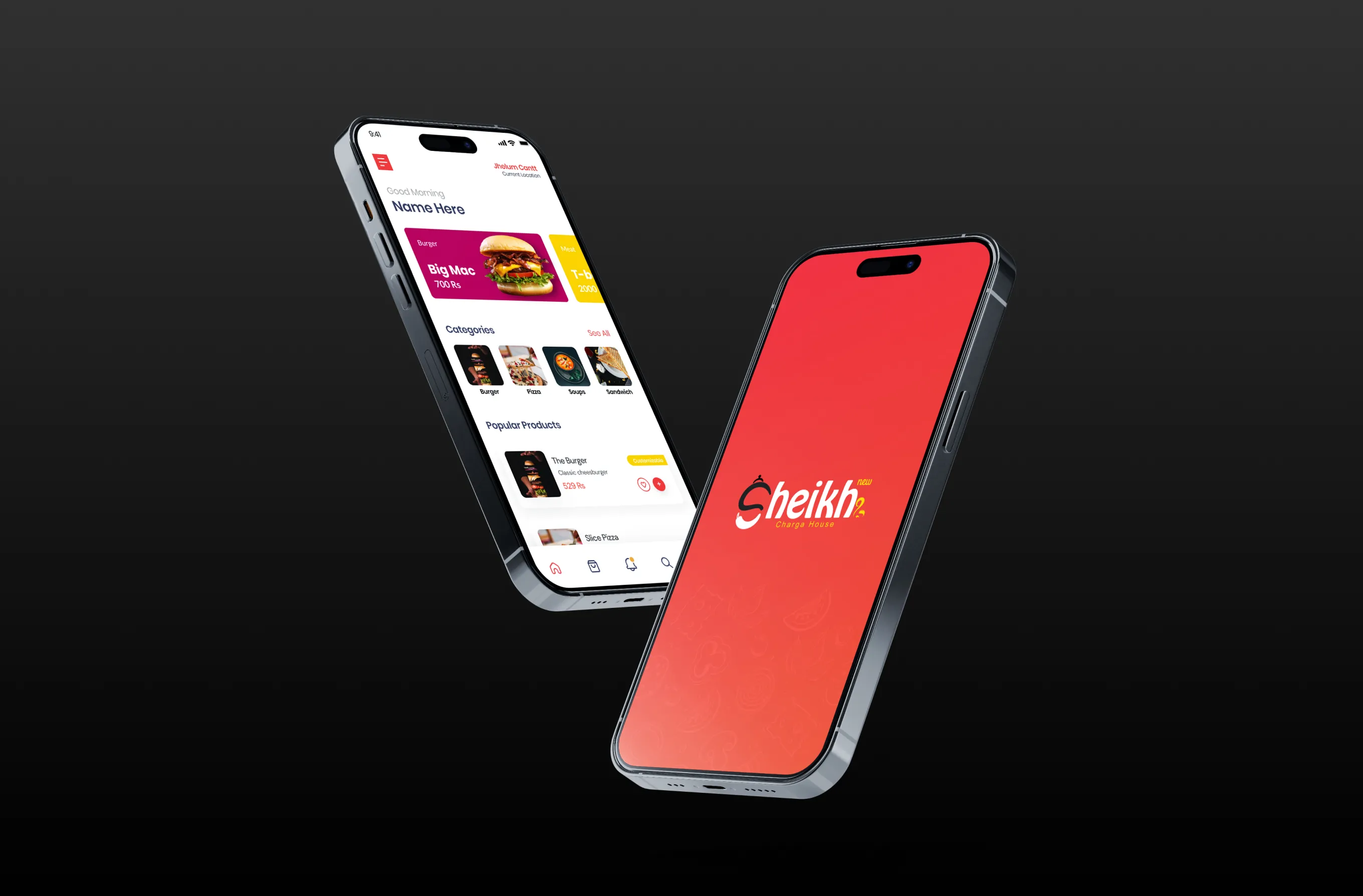
This project focused on creating a seamless, end-to-end mobile solution for food enthusiasts. The goal was to eliminate the "choice paralysis" often found in delivery apps by designing a clean, organized interface that puts the food first and simplifies the path to purchase.
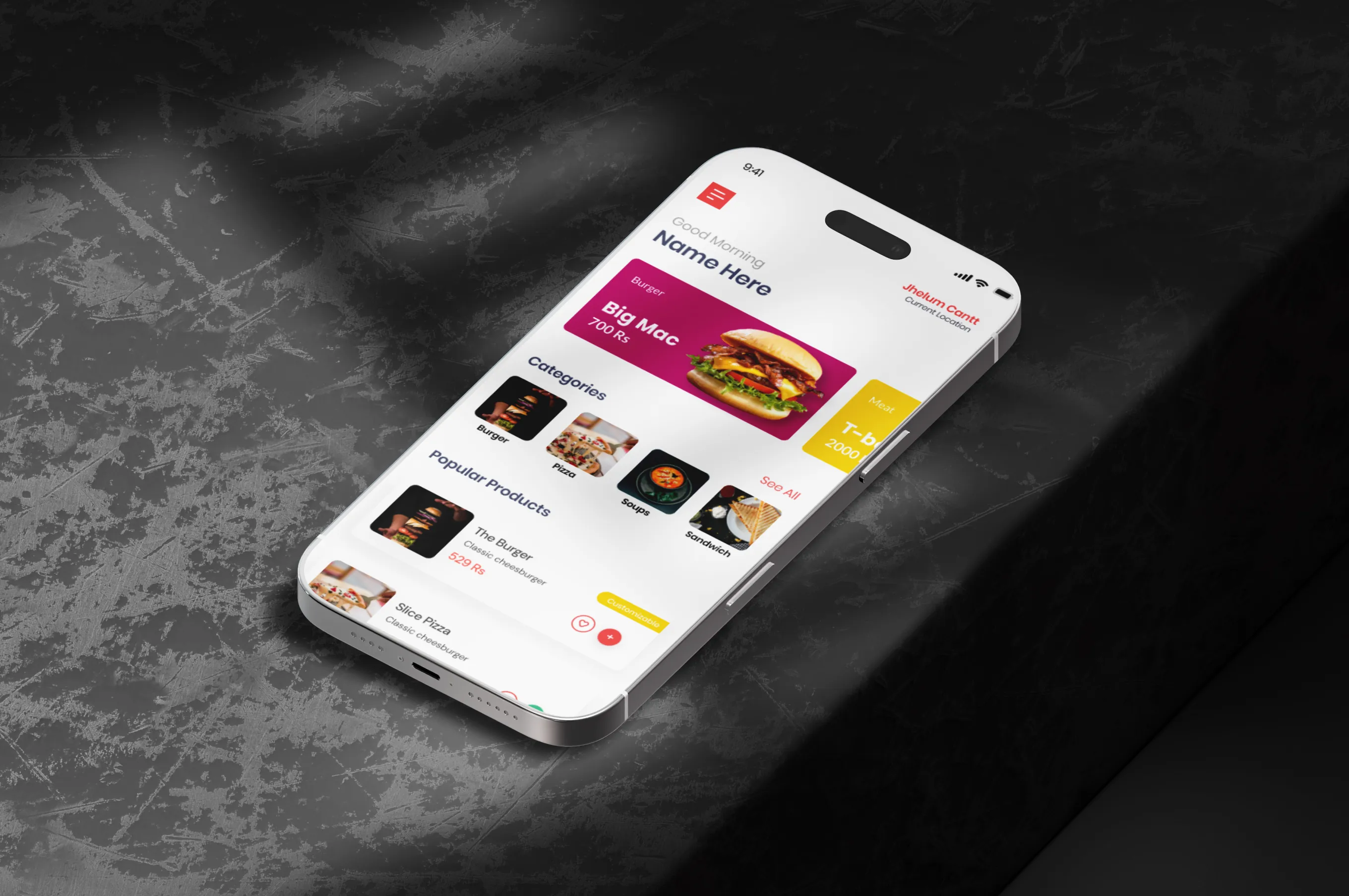
Many delivery apps overwhelm users with too many banners, confusing navigation, and cluttered menus. This friction leads to higher drop-off rates. I set out to design a solution that feels calm and intuitive, ensuring users spend less time searching and more time enjoying their meals.
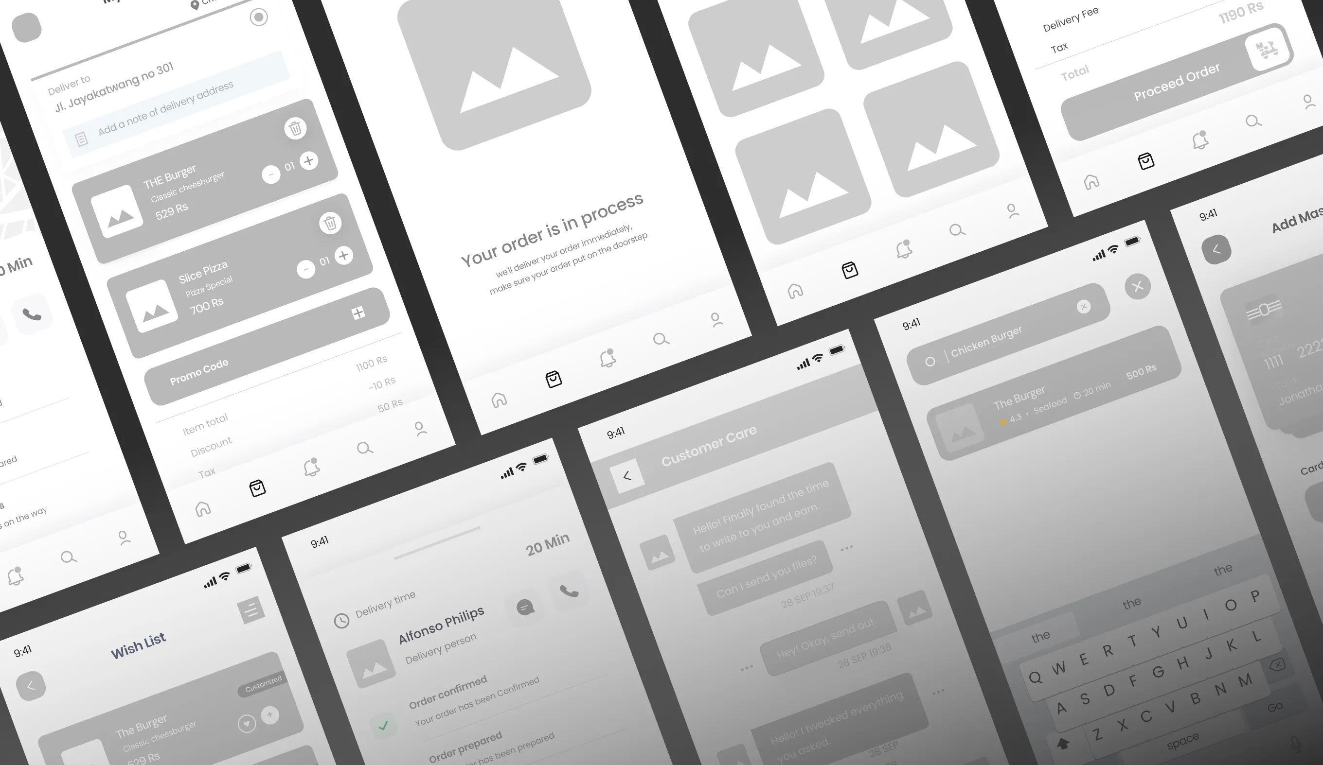
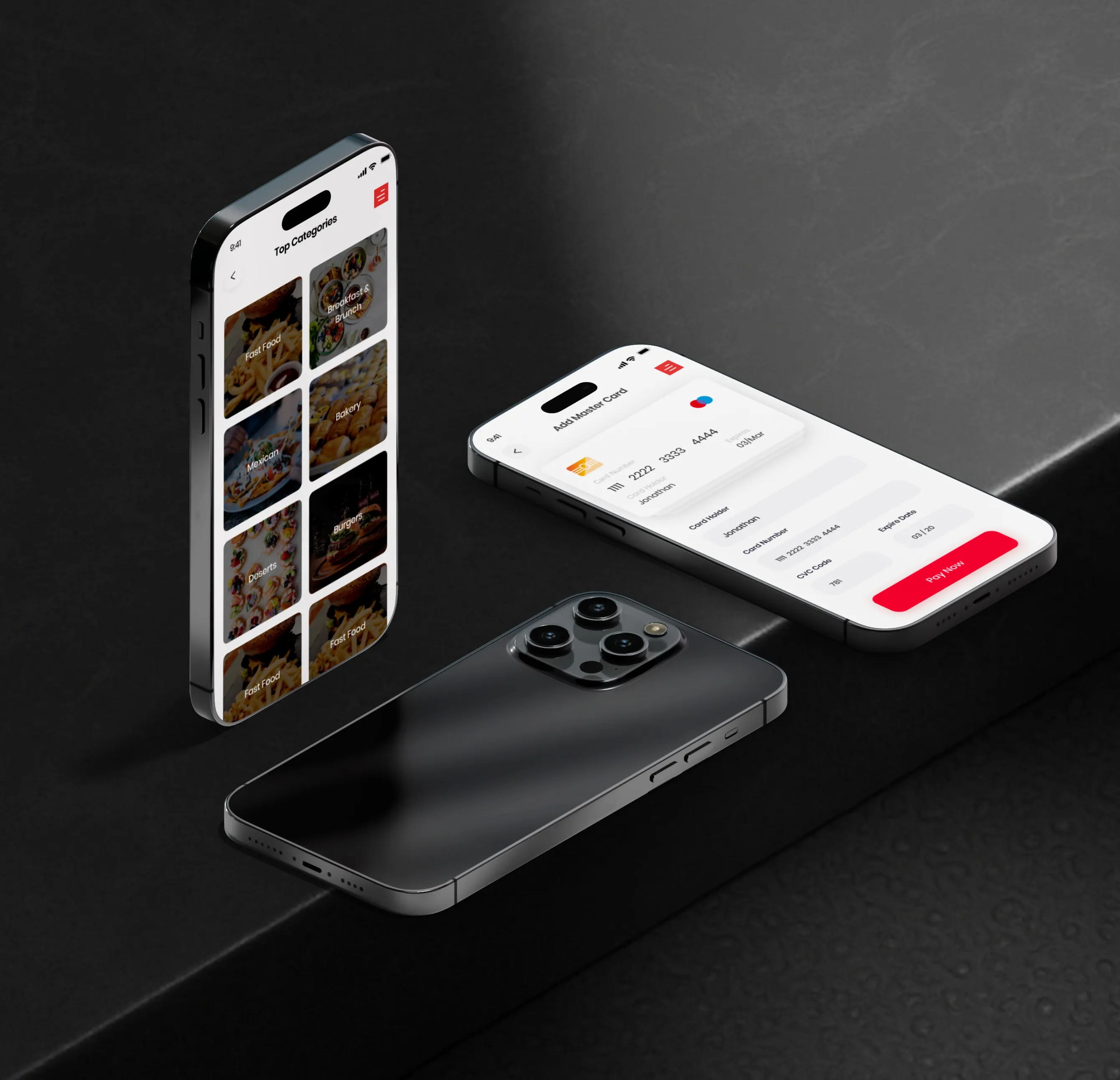
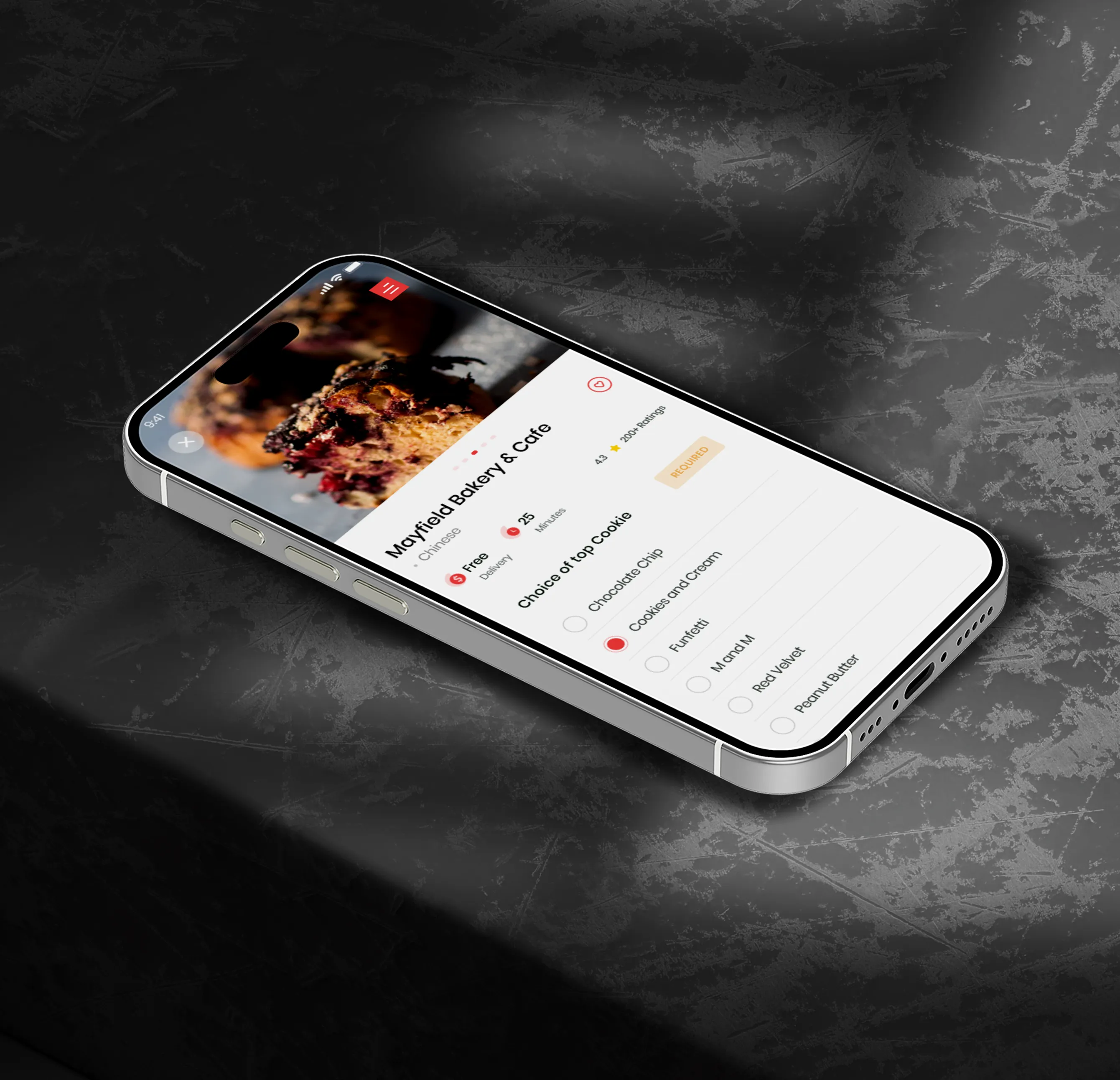
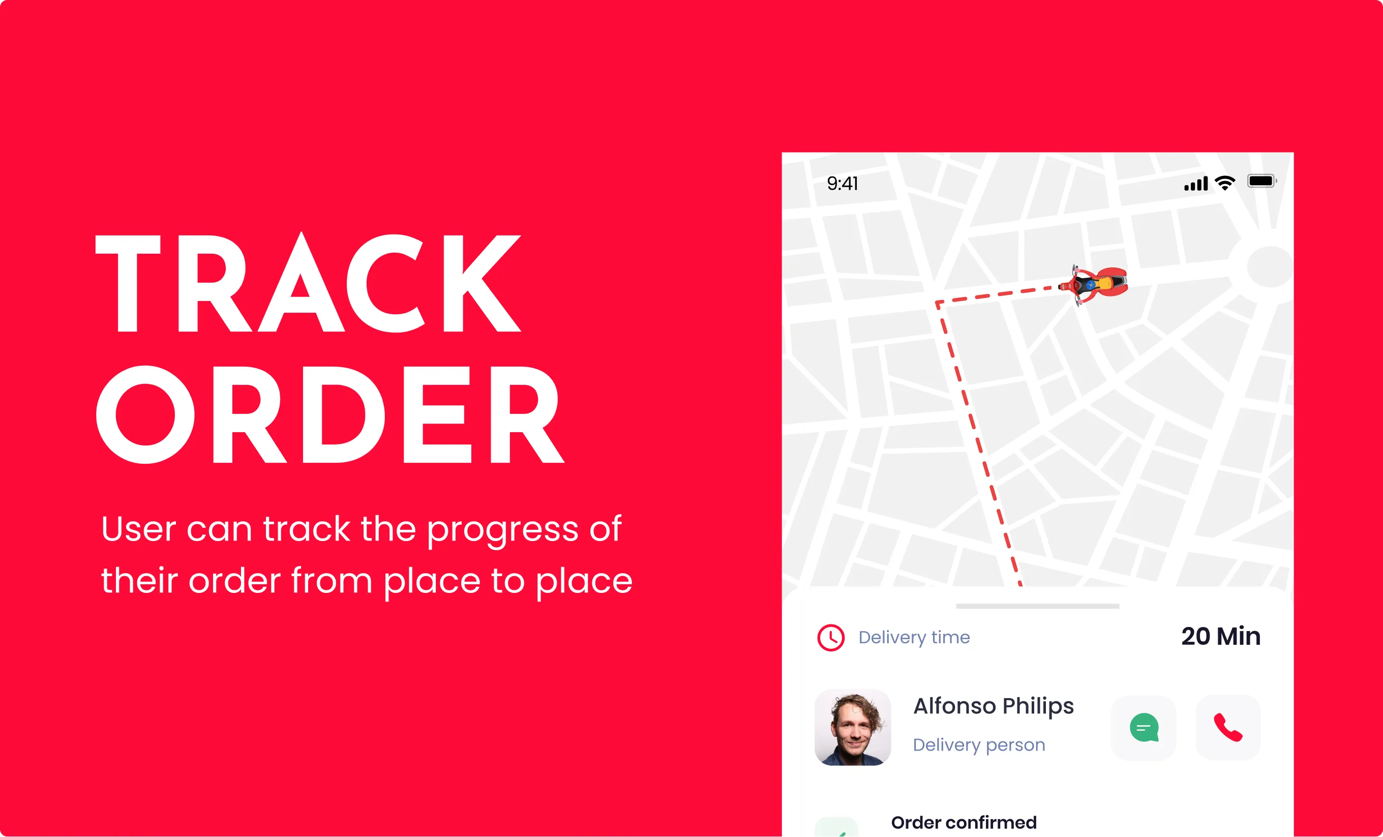
We believe a great meal is all in the details. The Product Page provides a deep dive into every dish, featuring comprehensive descriptions and high-quality visuals. To enhance the user experience, I integrated a dedicated "Add-ons" section, allowing for seamless customization from extra toppings to side sauces ensuring the final order is exactly how the user wants it.
.webp)
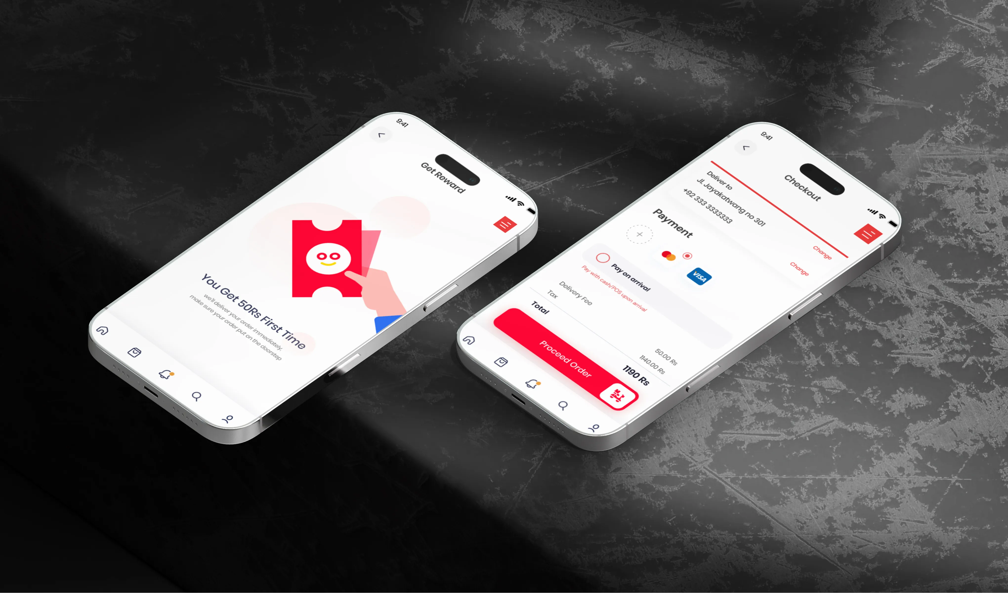
The result is a high-fidelity prototype that balances modern aesthetics with functional efficiency. By prioritizing white space and clear typography, the app provides a premium feel that builds user trust and makes the food ordering process feel like a fun, effortless experience.
.webp)
.webp)
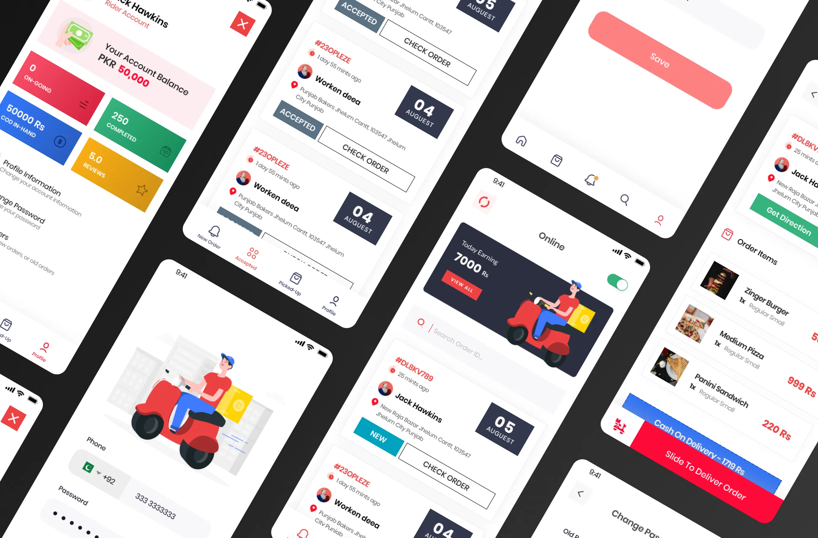
A separate app flow has been built for the rider to have easy access to the details of the order and the customer.
.webp)
.webp)
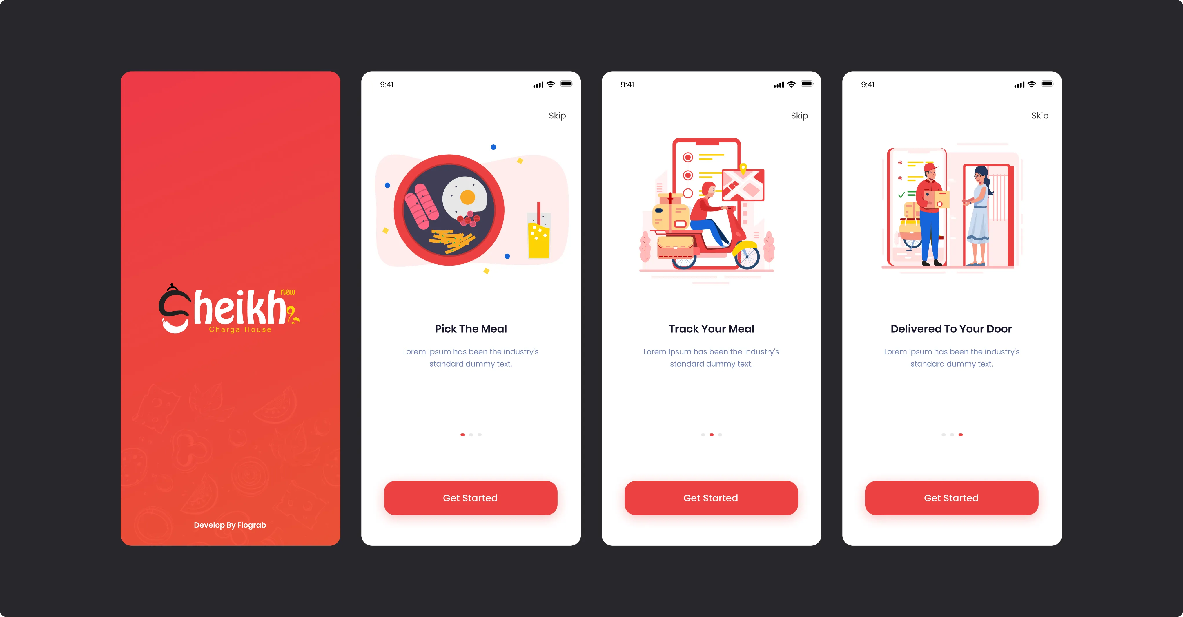
This onboarding flow begins with a branded launch screen featuring the "Sheikh Charga House" logo, followed by a series of instructional steps.These screens utilize clean illustrations and clear calls to action, such as the "Get Started" button, to streamline the transition to account login and location selection.
.webp)
.webp)
All the branding has been done keeping the same colorful yet elegant Design featured on every individual part of the Brand.
.webp)
.webp)
.webp)
.svg)
11 Burford Road, e152st
.svg)
.svg)
C-Block, Citi Housing Jhelum, 49600
.svg)
.svg)

.webp)
