
.svg)
Aneralife - CRO Audit
CRO audit of a wellness supplement eCommerce brand — pinpointing why the homepage wasn’t converting and the redesign that fixes it.
Year
2025
Services
Web Design & CRO Audit
Industry
Healthcare
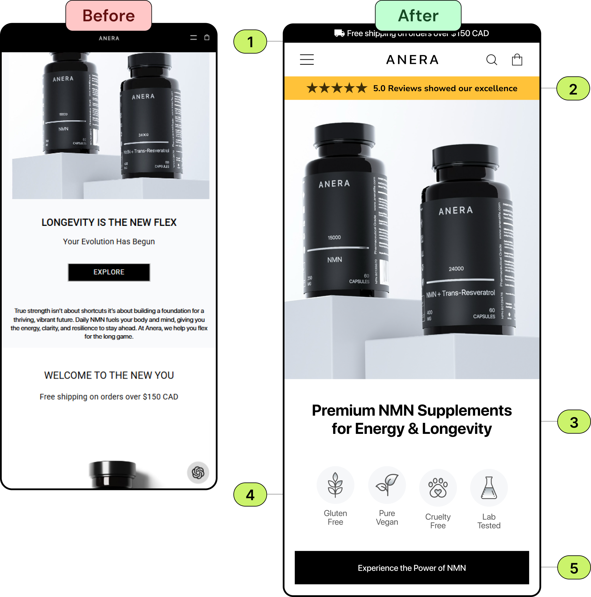
- Use a minimal top announcement bar with a free shipping icon. Your nav should be responsive, just like the rest of your site. Decide what is critical for users to access outside the mobile menu and place it in the navigation. Decrease the size of the logo and Following the general rule of thumb—logo (home), menu, and cart.
- Displaying your reviews and a high star rating builds instant credibility, encouraging trust from new users.
- Enhance the headline and highlight the unique selling point of your service, making a compelling case for users to buy.
- Add the key traits prominently for easier readability, allowing users to see better the benefits they can take advantage of, thus helping break down the purchase barrier more easily.
- Pull in a full-width CTA at the bottom of the page navigating your users to 'Explore the power of NMN’. Ensure action buttons are 56px in height on mobile, sit at the bottom, and use them as communication tools.
Recommendation
The Audit: Why the Homepage Wasn’t Converting
The Challenge
1.
Cluttered navigation and an oversized logo competed with the message
2.
The free-shipping incentive wasn't surfaced in a top announcement bar
3.
No ratings or social proof to reassure new visitors
4.
The headline didn't lead with a clear, unique selling point
5.
Key product features were not scannable or icon-led
6.
A weak CTA with no clear next step
The Solution
We redesigned the homepage around conversion best practice — a clean nav with a free-shipping bar, prominent ratings, a benefit-led headline, scannable feature icons, and a high-contrast CTA. The result is a focused, mobile-first homepage built to convert.
Book A Free Call
Get a focused CRO audit and a clear, prioritized redesign plan for your store.

Focused Messaging
%201%20(1).svg)
Conversion-Focused Design

Industry-Tested UX
.svg)
.svg)
.svg)
.svg)
.svg)
.webp)
