
.svg)
Samphire Neuro - CRO Audit
CRO audit of a women’s-health neurotech brand pinpointing why the product page wasn’t converting and the redesign that fixes it.
Year
2025
Services
CRO Audit
Website Revamp
Industry
Femtech
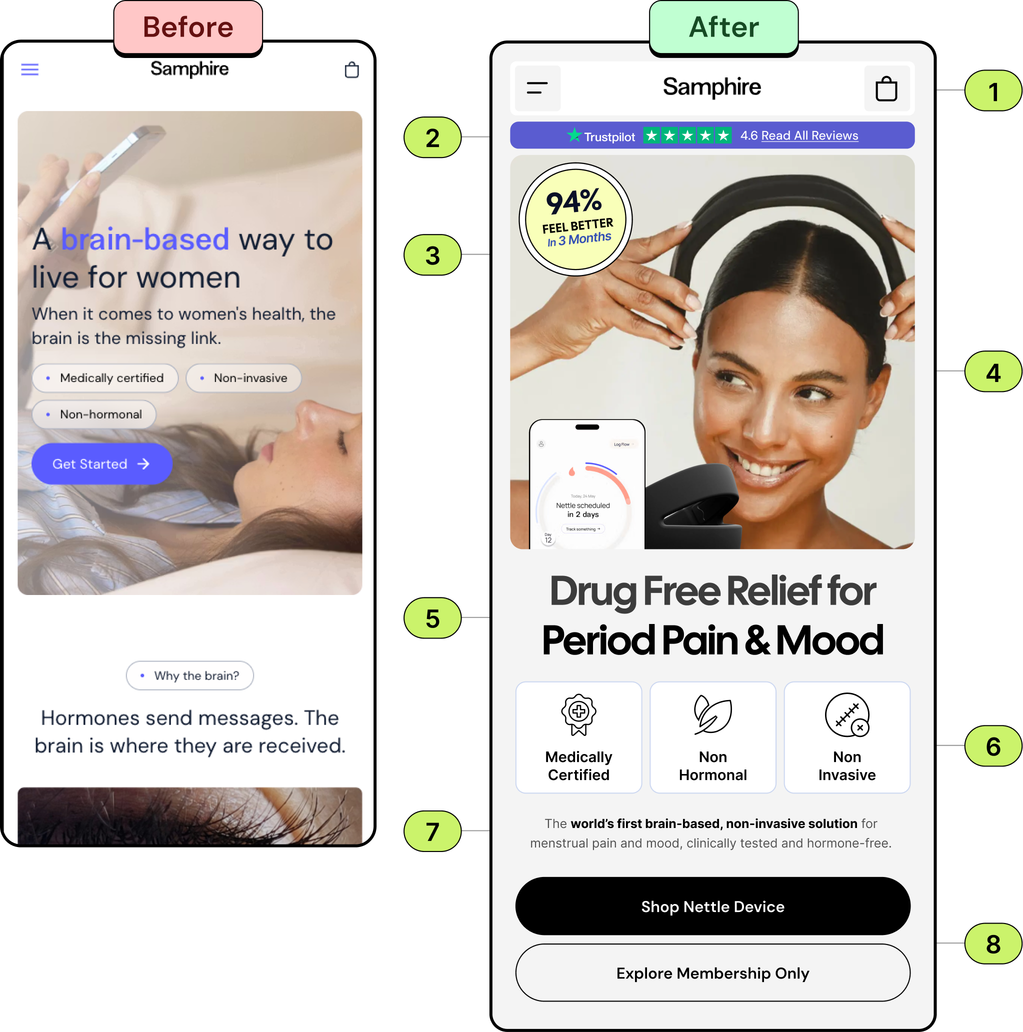
- Simplify navigation with a clean header. Use a minimal top bar with a hamburger menu and cart icon to reduce clutter and keep the focus on the core message.
- Build trust with social proof. Display ratings and reviews prominently at the top to establish credibility and reassure new visitors immediately.
- Showcase measurable results. Add a bold efficacy badge (e.g., “94% feel better in 3 months”) to provide proof of effectiveness and increase user confidence.
- Use an engaging hero image. Feature a relatable, happy user interacting with the product to create an emotional connection and communicate the benefit visually.
- Lead with a clear, outcome-driven headline. Highlight the key benefit (“Drug Free Relief for Period Pain & Mood”) to make the value proposition simple and compelling.
- Highlight key features with icons. Present important attributes in an easy to scan format that addresses user concerns quickly.
- A short, proof-driven line like “The world’s first brain-based, non-invasive solution…” builds authority. This ensures users understand the innovation and credibility of the product before diving into detailed features.
- Offer dual, high-contrast CTAs. Provide clear next steps for different user intents (e.g., “Shop Device” or “Explore Membership”) to increase conversions and reduce decision friction.
Also both buttons should be 56px in height and full-width for mobile optimization, ensuring they are easy to tap and visually consistent.
Recommendation
The Audit: Why the Product Page Wasn’t Converting
The Challenge
1.
Cluttered navigation pulled focus from the core message
2.
No social proof near the top to reassure new visitors
3.
The key result “94% feel better” wasn’t shown as proof
4.
Weak hero imagery, with no relatable, emotional hook
5.
An abstract, science-first headline buried the real benefit
6.
Key product features weren’t scannable or icon-led
7.
No short, proof-driven authority line
8.
Unclear CTAs that weren’t optimised for mobile tapping
The Solution
We redesigned the mobile product page around conversion best practice leading with a clear, outcome-driven headline, prominent ratings and efficacy proof, engaging imagery, scannable feature icons, and dual, thumb-friendly CTAs. The result is a focused, mobile-first page built to turn interest into purchase.