
.svg)
The Sauna Heater - CRO Audit
CRO audit of a sauna-heater eCommerce brand — pinpointing why the homepage wasn’t converting and the redesign that fixes it.
Year
2025
Services
CRO Audit
Industry
eCommerce / Wellness
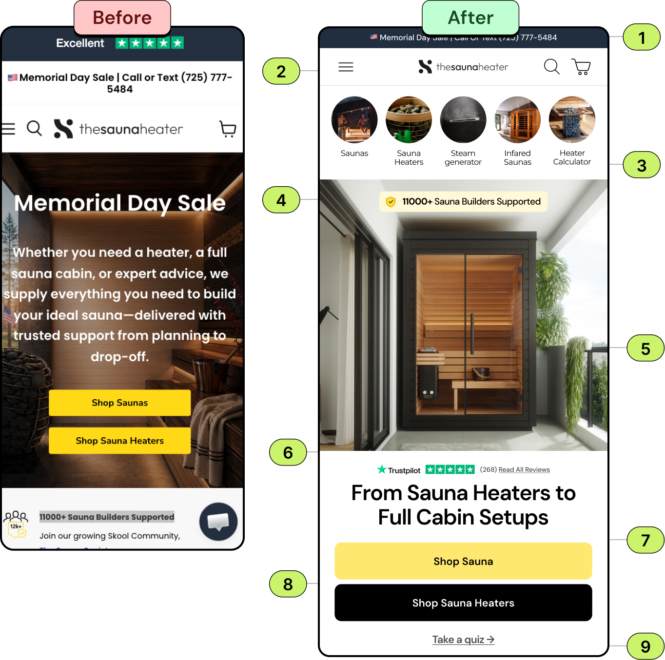
- For high price items, users often need reassurance before purchasing; providing a direct line to call or text lowers the barrier to entry, addresses buying hesitation upfront, and ultimately drives higher conversions.
- Your nav should be responsive, just like the rest of your site. Decide what is critical for users to access outside the mobile menu and place it in the navigation.Following the general rule of thumb—logo (home), menu, cart and search.
- Featuring top categories above the hero boosts user experience by offering quick, visual access to popular sections and guiding the shopping journey.
- Displaying a specific milestone like 11k+ supported leverages the psychological trigger of social proof. It instantly signals to new visitors that the brand is established, trusted by a massive community.
- The updated hero image of the product gives a clear visual idea. Ensure the image is optimized for quick loading to maintain engagement.
- Placing recognizable, third-party validation above the fold instantly builds credibility. It reassures visitors of quality and reliability the moment they arrive, neutralizing buyer hesitation early.
- Enhance the headline and highlight the unique selling point of your product, making a compelling case for users to buy.
- Offer high-contrast CTAs. Provide a clear next step to increase conversions and reduce decision friction.
- Adding the quiz link above the fold for complex or high-investment products, minimizes choice paralysis for users who aren't sure which setup fits their space or budget.
Recommendation
The Audit: Why the Homepage Wasn’t Converting
The Challenge
1.
No direct call or text option to reassure buyers of high-price items
2.
Navigation wasn't responsive or focused on key actions
3.
Top categories weren't surfaced above the hero
4.
No social-proof milestone to signal an established brand
5.
The hero didn't show the product clearly or load efficiently
6.
No third-party validation above the fold
7.
The headline didn't highlight a clear unique selling point
8.
Weak, low-contrast CTAs
9.
No quiz link to guide buyers unsure which setup fits
The Solution
We redesigned the homepage around conversion best practice — a direct call/text option, a clean, responsive nav, top categories and a clear product hero above the fold, social-proof milestones and third-party validation, a benefit-led headline, high-contrast CTAs, and a guided quiz link. The result is a focused, mobile-first homepage built to convert.
Book A Free Call
Get a focused CRO audit and a clear, prioritized redesign plan for your store.

Focused Messaging
%201%20(1).svg)
Conversion-Focused Design

Industry-Tested UX
.svg)
.svg)
.svg)
.svg)
.svg)
.webp)
